Table Of Contents
Static figures work fine for a print publication. However, when you want to present your research or collected data online, static is stale and dynamic is alive. Today we’re going to take a CSV and create a simple, but interactive, scatter plot. This tutorial assumes some basic familiarity with HTML and JavaScript. If you don’t currently possess these skills, head on over to Codecademy and follow the Web Fundamentals track and the JavaScript track.
Setting Up
To begin, we need to make sure we have the CSV we want to load and the JavaScript library jquery-csv in the same folder as our HTML.
Preview and Data
Here’s the end result of this tutorial: Finished Chart The data I’ll be using is from the three wave KwaZulu-Natal Income Dynamics Study (KIDS). In this example I will be using the first round of the survey (1993). Children are household members listed as younger than 16 and pensioners are defined as males over 65 and females over 60. I use an adult equivalent measure of household income used by Carter and May (1999) and many others in the South African context. The cleaned CSV can be downloaded here. I recommend you download this CSV to work along with this tutorial, but feel free to use your own (just be careful to make the relavent changes to the example code). Add the CSV to the same folder as the HTML we will be creating.
jQuery-CSV
The jQuery-CSV library
allows us to easily take a string of CSV data and transform it into the appropriate format for Google’s visualization library.
Download either jquery.csv-0.71.js or jquery.csv-0.71.min.js from that page and add it to the folder where your HTML will go.
Accessing the CSV
To begin with, create the HTML document, load the Google JS API, jQuery, and the jQuery library, and display the contents of the CSV to confirm the CSV is where it’s supposed to be and that we can access all the JavaScript we need:
<!DOCTYPE html><html><head><title>Google Chart Example</title><script src="https://www.google.com/jsapi"></script><script src="https://code.jquery.com/jquery-1.10.1.min.js"></script><script src="jquery.csv-0.71.js"></script><script>// wait till the DOM is loaded$(function() {// grab the CSV$.get("kzn1993.csv", function(csvString) {// display the contents of the CSV$("#chart").html(csvString);});});</script></head><body><div id="chart"></div></body></html>
Load your newly created HTML to confirm your code outputs the contents of the CSV.
A Simple Scatter Plot
Clear the script tag we used to display the CSV; in this section we will focus on the JavaScript necessary to create a scatter plot with our CSV. Start by loading the visualization library and setting a callback function:
// load the visualization library from Google and set a listenergoogle.load("visualization", "1", {packages:["corechart"]});google.setOnLoadCallback(drawChart);
Next, we need to create the callback function we referenced in the previous step. We’ll begin by grabbing the CSV as we did previously:
function drawChart() {// grab the CSV$.get("kzn1993.csv", function(csvString) {
We need to transform the CSV into a format suitable for Google’s visualization library:
// transform the CSV string into a 2-dimensional arrayvar arrayData = $.csv.toArrays(csvString, {onParseValue: $.csv.hooks.castToScalar});
Next, we’ll transform this array into a DataTable object:
// this new DataTable object holds all the datavar data = new google.visualization.arrayToDataTable(arrayData);
Since we have more columns of data than are needed for our visualization, let’s create a view on this table of just the first two columns:
// this view can select a subset of the data at a timevar view = new google.visualization.DataView(data);view.setColumns([0,1]);
Now let’s set some basic options for our chart:
var options = {title: "KwaZulu-Natal Household Survey (1993)",hAxis: {title: data.getColumnLabel(0), minValue: data.getColumnRange(0).min, maxValue: data.getColumnRange(0).max},vAxis: {title: data.getColumnLabel(1), minValue: data.getColumnRange(1).min, maxValue: data.getColumnRange(1).max},legend: 'none'};
Now we need to bind a chart to our <div> and tell the chart to draw the current view with the options we selected:
var chart = new google.visualization.ScatterChart(document.getElementById('chart'));chart.draw(view, options);
All that’s left for this stage is to close our function blocks:
});}
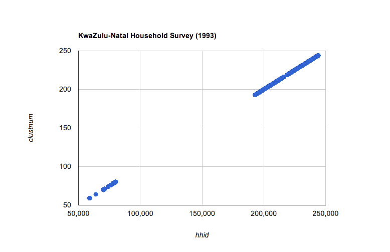
If you load our current progress you should see the following (relatively meaningless) chart: 
Adding Interaction
This chart already features interactivity in the form of rollover states for the plotted points. What we really need is to be able to change the variables we are plotting on the fly. Add the following tags after the </div> tag. I place the range first so that it lines up with the y-axis title:
<select id="range"></select><select id="domain"></select><button type="button">Update Chart</button>
Now we need to update our script to first load the <select> tags with the CSV headers, and also to respond to a click on our button.
Adding <options> to the <select> elements
Immediately following the assignment of arrayData, add the CSV headers to the <select> element:
// use arrayData to load the select elements with the appropriate optionsfor (var i = 0; i < arrayData[0].length; i++) {// this adds the given option to both select elements$("select").append("<option value='" + i + "'>" + arrayData[0][i] + "</option");}
Make sure the <select> elements show the starting options:
// set the default selection$("#domain option[value='0']").attr("selected","selected");$("#range option[value='1']").attr("selected","selected");
Updating the Chart
Now we need to assign a function to the button we created. Add the following after chart.draw(view, options);:
// set listener for the update button$("button").click(function(){
Assign the selected column indices to local variables:
// determine selected domain and rangevar domain = +$("#domain option:selected").val();var range = +$("#range option:selected").val();
Update the view to reflect the selected columns:
// update the viewview.setColumns([domain,range]);
Update the axis titles and the axis ranges:
// update the optionsoptions.hAxis.title = data.getColumnLabel(domain);options.hAxis.minValue = data.getColumnRange(domain).min;options.hAxis.maxValue = data.getColumnRange(domain).max;options.vAxis.title = data.getColumnLabel(range);options.vAxis.minValue = data.getColumnRange(range).min;options.vAxis.maxValue = data.getColumnRange(range).max;
Update the chart and close the function block:
// update the chartchart.draw(view, options);});
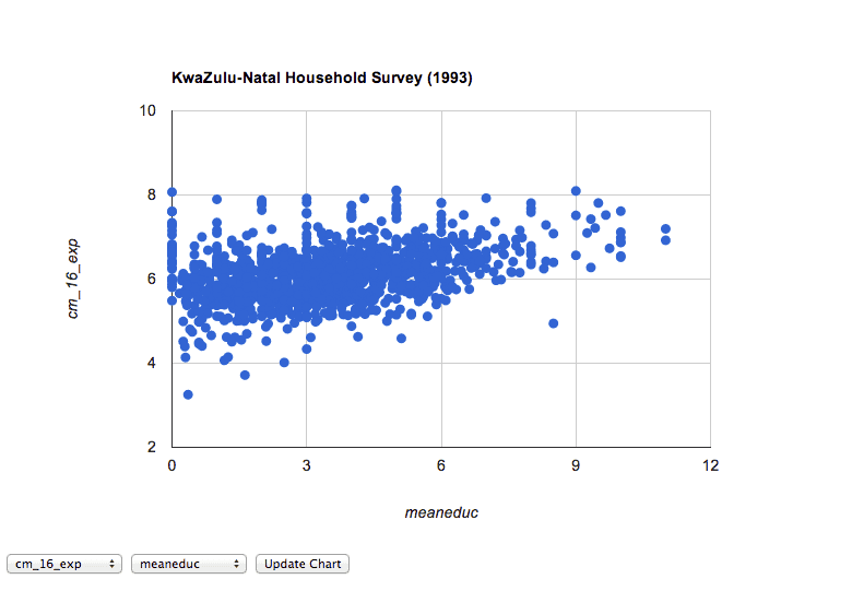
Cool! Now we can do more interesting comparisons like plotting cm_16_exp and mean_educ. Here’s what our current chart looks like:

Even Better UX
UX = User experience. User experience design is an important consideration. We want visitors to our site/blog to enjoy exploring our data. To make our chart more enjoyable, let’s remove the annoying step of having to click the button to update. Simply change this:
$("button").click(function(){
to this:
$("select").change(function(){
and remove the <button> tag. Now your chart should look like
this
(view the source and compare to yours if your chart is not working).
Conclusion
I hope you enjoyed this tutorial, and especially the end project. Now, to use your own CSV, all you need to do is change the
file string ”kzn1993.csv” to the name of your CSV and change the title in the chart options.
In the next tutorial, we’ll use the Google visualization library to make a bubble chart. (Check out the third tutorial in this series: Google Charts and CSV Part 3: Side-by-Side Bubble Charts)
As always, place any questions or comments in the section below. Thanks!
Share
38 Comments
Related Posts
Quick Links
Legal Stuff
Social Media
